B2C/B2B2C Travel Insurance Product
XCOVER TRAVEL
Project OVERVIEW
-
About
XCover delivers personalized warranties, travel insurance and shipping protection in all categories, at a price that’s optimized for your GMV. Available at Amazon, British Airways, eBay, Wayfair, Descartes ShipRush, and thousands more, XCover.com makes protection simple, fast, and stress-free - which is why over 6 million global customers trust us to protect the things they love.
-
Project details
Sector: Insurance Tech
Project Type: UX/UI Design, User Research
Challenge: Build a B2C travel insurance product
Team: Leo Gonzalez - Senior Product Designer
Caitlyn/Gloria - Product Manager
Ben Bishop - Engineering manager
Design Brief
-
Problem
XCover has achieved significant success in selling travel protection globally through embedded experiences. However, to further scale revenue and customer acquisition, we must explore opportunities beyond embedded offerings. While partners recognize the value of embedded insurance, these opportunities are not always immediately available. As a result, our team must develop a solution that demonstrates our ability to drive revenue and customer loyalty independently, making our travel protection offer a compelling addition for partners.
-
Project Goal
We have gathered partner feedback indicating interest in a cobranded post-purchase insurance offer. This solution should require no development effort from partners and be fully managed by XCover, allowing seamless integration into their customer journey. Additionally, we aim to create a direct-to-consumer (D2C) product that complements the partner-led offering, ensuring a broader reach and diversified acquisition channels.
-
Strategy
We will leverage our existing organic travel traffic as a foundation for customer acquisition and to test a D2C insurance offer. Our strategy focuses on developing a seamless, cobranded post-purchase insurance offer that meets partner requirements and enhances customer engagement. Through targeted user research, we will refine messaging, pricing, and experience to appeal to a diverse audience. By optimizing our D2C approach with data-driven iterations, we aim to maximize conversion and retention. This strategy will enable us to build a scalable, high-impact travel insurance solution that benefits both partners and consumers while driving long-term revenue growth for XCover.
Discovery
Discovery
Exploring user needs and market gaps to create the right product.
Competitive Analysis
Kicking off with a competitive analysis set the stage for a deeper dive into the direct-to-consumer travel insurance landscape. By comparing various offerings, I gained valuable insights into who our true competitors are, what they do best, and where they fall short. This side-by-side evaluation quickly revealed a few gaps in the market we could take advantage of.
Key Insights From Partner Interviews
Interviews with travel partners highlighted the need for a flexible, non-embedded protection offer. They wanted the ability to sell protection at any stage without disrupting their booking flow or impacting conversions. An external solution was appealing, as it required no internal development resources and provided greater flexibility in how and where they could offer travel protection.
ORGANIC TRAFFIC
By analyzing our web traffic through Google Analytics, I discovered that our travel protection page attracted over 50,000 organic users within a six-month period. This insight highlighted a significant opportunity to leverage existing organic traffic as a low-effort way to gauge product appeal. By tapping into this steady stream of engaged users, we could measure interest and refine our offering with minimal development investment, making it a strategic and efficient approach to product validation.
Upsell Through Internal Partner
Our internal business, which sells rental cover protection, presents a valuable opportunity to upsell our travel protection through the account page. With a built-in audience of over 100,000 users, we can strategically market our offering to an engaged customer base that already values protection products. This approach carries minimal risk, as we have full control over the experiment, allowing us to test messaging, positioning, and user engagement while leveraging an existing ecosystem to drive incremental growth.
DEFINE
DEFINE
Turn research into clear objectives, create a roadmap, and establish product priorities.
Aligned Project Goals
Collaborating closely with the product team and engineering lead, I worked to align business goals, user needs, and technical constraints—an essential step in the product development phase. Ensuring all stakeholders were on the same page early on helped us prioritize features that delivered value while remaining feasible within our technical framework. This alignment not only streamlined decision-making but also prevented roadblocks down the line, allowing us to move forward efficiently and with confidence in our approach.
Product Roadmap
Our feature roadmap for the XCover travel insurance offer serves as a strategic bridge between our high-level goals and the logistical execution of the project. I collaborated with the team to prioritize features that would drive the greatest impact for both the business and users. Additionally, I considered how to support testing efforts, including user testing and QA, to ensure a seamless rollout.
IDEATE
IDEATE
Brainstorm, refine ideas, and explore different approaches to shape the product’s direction.
PAINTED DOOR TEST
We launched a painted door test through rentalcover.com to assess the market appetite for our travel insurance offer. The test yielded an impressive 11.2% click-through rate (CTR), surpassing the performance of previous upsell offers launched through this channel. This strong result validated the level of interest in our travel insurance product and provided the confidence needed to proceed with our first live experiment. The success of the test demonstrated clear demand, positioning us to expand our offering and further optimize the user experience through this channel.
INFORMATION ARCHITECTURE
I developed the information architecture for the XCover.com website with the goal of seamlessly integrating our travel protection offering into the marketing site experience. By designing a clear and intuitive structure, I ensured users could effortlessly explore and access the product without unnecessary friction. This approach is crucial for optimizing the user journey, increasing engagement, and driving conversions.
USER FLOW
I worked closely with the team to map out the user journey flow, ensuring we collect the essential trip information needed to surface relevant protection offers and facilitate payment. By carefully analyzing each touchpoint, we focused on creating an optimized and seamless purchase flow that aligns with user expectations while setting us apart from the competition. Our goal was to streamline the process, minimize friction, and deliver a highly intuitive experience that maximizes conversions.
Low-fidelity wireframes
I designed responsive wireframes for internal user testing, collaborating closely with the development team to address technical details and ensure feasibility. This process involved aligning with key stakeholders to ensure the design vision was consistent with business objectives, technical constraints, and user needs. By testing early and refining the wireframes based on feedback, we were able to identify potential issues and make necessary adjustments before moving into development.
Prototype
Prototype
Develop a functional model to replicate the user experience and validate features before full development.
Branding
To meet our partners' top requirement, I designed the experience to support co-branding elements, ensuring their users felt trust and confidence in the external offer. This resulted in two versions: a direct-to-consumer (D2C) experience and a partner-branded version. The D2C version maintained our brand identity, while the partner-branded version incorporated their logo, colors, and messaging.
Design System
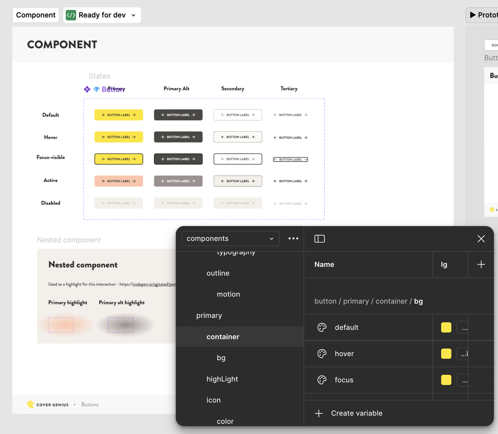
We leveraged the existing XCover design system to build a high-fidelity wireframe, ensuring consistency with established brand guidelines and UI patterns. The team agreed that this experiment should be lightweight and not require significant development effort, focusing on delivering a functional solution that could be refined and optimized later. By utilizing the design system, we were able to maintain efficiency and reduce development time.
High-fidelity wireframes
I designed high-fidelity wireframes approved by the product manager and engineering lead for usability testing. Testing the concept before development is crucial to ensure it meets user needs and identify potential issues early. This approach minimizes the risk of costly revisions and ensures the final product aligns with user expectations, business goals, and technical constraints.
TESTING
TESTING
Assess how well users can achieve their goals with the product & identify potential pain points
User Testing
Leveraging our high-fidelity wireframes, I designed a prototype to mimic the app's functionality for our research participants. I put together a research plan that details how we will test our travel insurance offer.
User Testing Objectives:
Determine how consumers make insurance purchasing decisions
Identify factors that contribute to or hinder users’ confidence in purchasing.
Investigate what motivating factors push users to purchase travel protection via a 3rd party website vs embedded experience
Recording Insights
I reviewed all five user test recordings multiple times, adding notes at key moments to capture important insights. This allowed me to identify challenges and positive reactions, providing a deeper understanding of the user experience. This detailed analysis is crucial for making informed, data-driven decisions to improve the design and usability.
Research Debrief
I created and presented a research debrief to the product team, sharing key insights and collaborating on next steps and product improvements. This was essential for aligning the team on user feedback, discussing opportunities for enhancement, and ensuring everyone was unified in moving the product forward. This process fosters transparency, alignment, and collective ownership of the product’s development.
KEY INSIGHTS
User testing revealed that while all participants recognized XCover, three were unclear about the company and its offerings. All users expected multiple protection options after completing the form, and three emphasized the importance of credibility when choosing a third-party provider. The main reason users opt for third-party sites is the lower cost and greater flexibility in options. These insights highlight opportunities to enhance brand clarity, trust, and the range of offerings.
USER Responses
User testing revealed that while many understood XCover and found the protection options simple, there was confusion around branding and a desire for more coverage details and tiered plans. Some users found the travel details collection too detailed, and others expressed concerns about account creation, payment options, and security. These insights point to opportunities to simplify the process, clarify messaging, and enhance the user experience.
User Quotes
Based on my research, customers choose third-party travel protection primarily for cost savings, with many specifically calling it "cheaper." They also value the user-friendly experience, more comprehensive coverage options, and better price-to-benefit ratios compared to initial providers. Customers appreciate the credibility, simple purchasing process, and accessible customer service these alternatives offer, showing that both value and service quality drive their decisions.
Key Insights Per Step
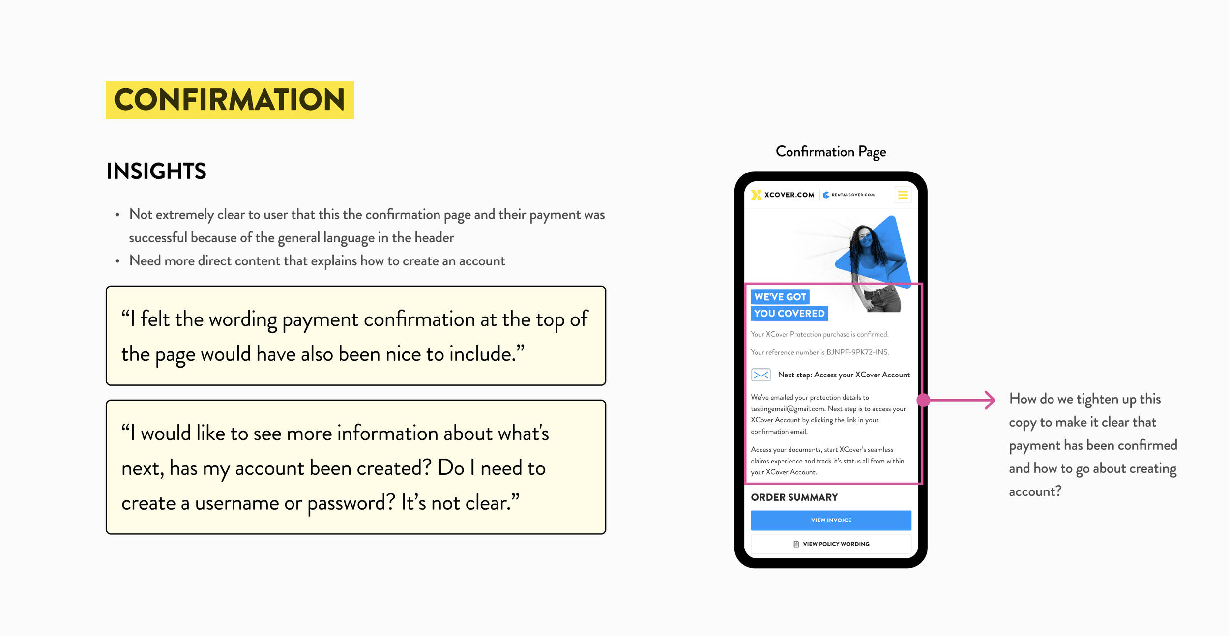
I presented improvement opportunities for each step in the user journey, using customer quotes to highlight pain points and areas for enhancement. I also raised discussion questions to encourage team collaboration and generate ideas. This approach provided actionable insights and fostered productive dialogue, helping to align the team on the next steps for product improvement.
Improvement Opportunities
After the presentation, I facilitated a brainstorming session to gather improvement opportunities from the team. This collaborative approach encouraged diverse ideas and fostered creative problem-solving, ensuring we identified user-centered solutions aligned with business goals. Engaging the team in this process is key to driving innovation and refining the product effectively.The research showed that users book appointments twice a week, mostly for wellness (83%) and home services (62%). Verified reviews matter most when choosing a service, while juggling multiple apps and struggling to find new services were top frustrations. These insights helped shape a design focused on convenience, trust, and easy discovery.
OUTCOMES
OUTCOMES
Performance metrics, testing insights, project reflection & next steps in product development.
Key Results
-
11.5%
11.5% Click-through rate
-
7 sales
7 Sales in 3 weeks
-
5 PARTNERS
5 partners agreed to launch co branded experience
USER INSIGHTS
I reviewed over 125 user sessions using FullStory, documenting heatmaps, key actions, and friction points. This analysis helped identify areas for improvement, providing data-driven insights to inform design changes. It is crucial in product development as it ensures a more seamless, user-centered experience by highlighting and addressing obstacles.
Funnel Insights
I collaborated with the development team to review funnel data in Google Analytics, focusing on customer drop-off points and identifying areas that needed attention to improve conversion rates. By analyzing the data together, we were able to pinpoint where users were disengaging and prioritize key touchpoints for improvement. This collaboration was vital in ensuring that our efforts were aligned with data-driven insights.
Future roadmap
I developed a Q1 and Q2 roadmap that included key improvement opportunities, prioritizing them based on their impact and lift score. We focused on easy wins with low effort, ensuring these high-priority opportunities were addressed first. To keep the team aligned, I documented Figma working files and created Jira tickets for each task on Confluence, providing clear visibility into progress and ownership. This approach ensured that we could execute efficiently, track progress, and stay focused on driving meaningful improvements to the product.
FUTURE DESIGN EXPLORATIONS
After thoroughly analyzing user insights gathered post-launch, I began exploring design options to enhance our travel insurance product. By identifying key pain points and areas for improvement from user feedback, I focused on creating solutions that optimize the overall experience. My design approach prioritized clarity, ease of use, and efficiency, ensuring that users could seamlessly navigate the purchase experience.


