IMPROVED CLAIMS EXPERIENCE
CLYDE CLAIMS
Project OVERVIEW
-
About
Clyde enables businesses to offer extended warranties, product registration and global shipping protection with tracking all from a single platform. Clyde supports the end to end customer experience from purchasing a plan to filing a claim, to receiving support and a resolution. Clyde increases conversions and inspires customer loyalty at every interaction with clear coverage terms and painless claims.
-
Project details
Sector: Insurance Tech
Project Type: UX/UI Design, User Research
Challenge: Improve claims experience
Team: Leo Gonzalez - Senior Product Designer
Director of Product - Caitlyn Cambell
Lead Developer - Nick Scaglione
Design Brief
-
Problem
Clyde’s claims process lacks responsiveness, causing delays and requiring excessive manual intervention. Automatic resolution rates are low, and users find the current filing process frustrating. Customer Support feedback highlights a need for optimization to improve efficiency, reduce processing times, and enhance overall satisfaction.
-
Project Goal
By analyzing customer feedback, support team insights, and key performance metrics, we aim to enhance the claims experience. Our goal is to improve automation, responsiveness, and ease of use, ensuring a more seamless process for both customers and internal teams. We will prioritize changes that simplify interactions, reduce claim resolution time, and increase user confidence in the system.
-
Strategy
We will conduct user research to pinpoint key pain points, develop and test targeted experience improvements, and implement a more responsive, mobile-friendly solution. By emphasizing automation, intuitive design, and real-time feedback, we will create a faster, more efficient, and user-friendly claims process that meets the needs of our growing mobile customer base.
Discovery
Discovery
Exploring user needs and market gaps to create the right product.
PRODUCT AUDIT
Our claims audit highlights key areas for improvement. The average claim submission time is 12 minutes, indicating a need for a faster process. With a 65% first contact resolution rate, many claims require follow-ups, impacting efficiency. Additionally, 73% of claims are submitted via mobile, emphasizing the need for a seamless mobile experience. These insights point to key opportunities to refine our claims process for better efficiency, automation, and customer satisfaction.
DESIGN AUDIT
My product team and I conducted a comprehensive design audit of the current claims experience to identify areas for improvement. We systematically reviewed each step of the process, assessing usability, accessibility, and overall user flow. Our evaluation was informed by direct user feedback gathered from recent usability tests, as well as established UX best practices. We documented pain points, inconsistencies, and friction in the experience, highlighting opportunities to enhance clarity, efficiency, and engagement.
Affinity Map
I facilitated an affinity mapping session with the Customer Support and Product teams to synthesize key insights from the claims audit. This exercise helped categorize recurring pain points, align on top user frustrations, and break down complex data into actionable themes. By organizing feedback visually, we prioritized improvements like reducing claim submission time, increasing first-contact resolution, and optimizing the mobile experience. This session ensured alignment across teams and provided clear next steps for enhancing the claims process.
DEFINE
DEFINE
Turn research into clear objectives, create a roadmap, and establish product priorities.
Aligned Project Goals
This Venn diagram maps business goals, user needs, and technical constraints, ensuring alignment in product development. It highlights priorities like improving the claims experience, enhancing navigation, and maintaining technical feasibility. By visualizing these factors, we streamlined decision-making and prioritized impactful, achievable solutions to enhance efficiency, usability, and automation in the claims process.
Product Roadmap
The feature roadmap is the best way to move from the above goals to the logistical aspect of the project. Here I aligned with the team to ensure we were prioritizing features that would have the most impact for the business and users. Additionally, it’s important to see how I would help support testing these features, such as user testing or QA. The information can help me weigh out what becomes a priority or not.
IDEATE
IDEATE
Brainstorm, refine ideas, and explore different approaches to shape the product’s direction.
INFORMATION ARCHITECTURE
I mapped out the information architecture of the Clyde website to streamline how users would access the claim submission feature. By designing a clear, intuitive structure, I ensured easy navigation and minimized unnecessary steps. This step is vital in product design as it enhances user experience, increases task efficiency, and makes key features like claim submission easily discoverable.
USER FLOW
I mapped out the user journey for filing a claim, focusing on each step a user would take from start to finish. This included identifying pain points and areas for optimization, such as simplifying form fields and reducing unnecessary steps. We plan to test these optimizations to ensure a smoother, more efficient experience.
Low-fidelity wireframes
I designed wireframes for the updated flow we aimed to test, focusing on creating a clear, intuitive layout that guides users through each step of the process efficiently. These wireframes serve as a visual blueprint, outlining key elements and interactions while allowing us to quickly iterate and refine the design.
Prototype
Prototype
Develop a functional model to replicate the user experience and validate features before full development.
Branding
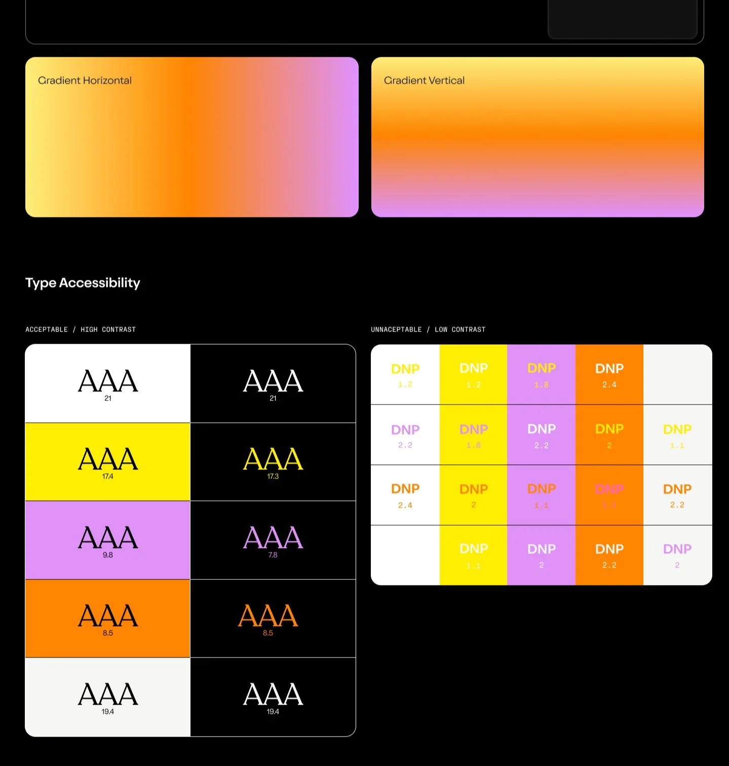
I worked on rebranding Clyde to align the user experience with the new brand identity, ensuring consistency across all touchpoints. This rebranding was integral to updating the flow, as it required incorporating new design elements, color schemes, and typography to reflect the refreshed brand while maintaining a seamless and intuitive user experience.
Design System
The rebrand included several updates to the design system, such as new color palettes, typography, and UI components, which needed to be tested and integrated into the new claims experience. This ensured that the visual elements were consistent with the refreshed brand identity while maintaining functionality and usability.
High-fidelity wireframes
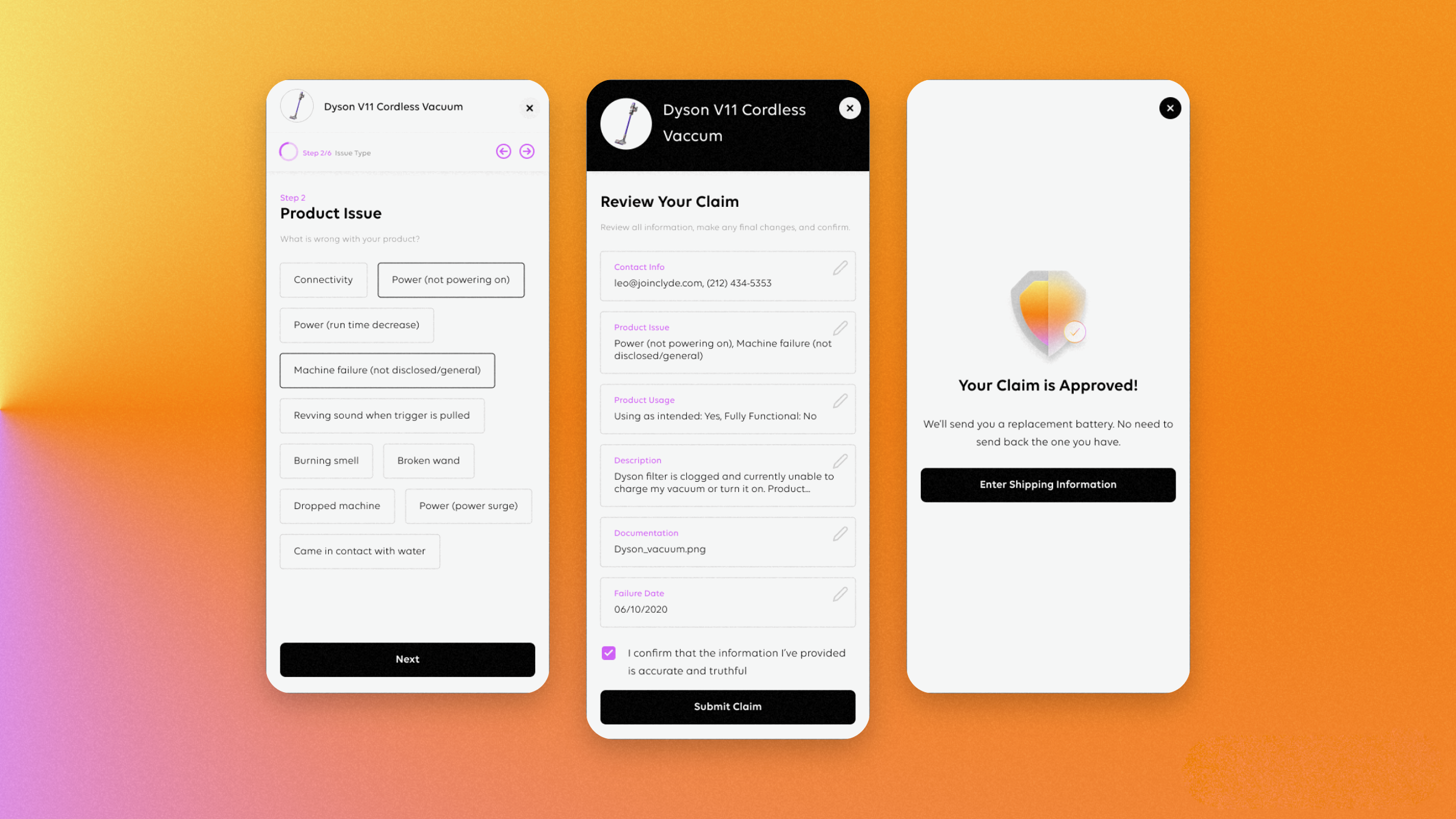
I leveraged the new design system to create high-fidelity wireframes that would serve as a foundation for usability testing, alignment with the development team, and identification of areas needing further exploration. By incorporating updated design components, I ensured the wireframes were both visually consistent with the rebrand and functional for testing.
TROUBLESHOOT EXPLORATIONS
I designed multiple iterations of the troubleshooting experience to explore how we balance user needs with technical constraints. Each iteration aimed to improve clarity and efficiency while ensuring feasibility within existing system capabilities. By testing different approaches, I assessed how design adjustments could enhance usability without exceeding technical limitations.
TESTING
TESTING
Assess how well users can achieve their goals with the product & identify potential pain points
User Testing / Interviews
Leveraging our high-fidelity wireframes, I designed a prototype to mimic the app's functionality for our research participants. I put together a research plan that details how we will test the new claims experience to better understand how we can develop the most seamless claims/support experience.
User Testing Objectives:
Assess whether users clearly understand the step-by-step process for submitting a claim.
Measure the time taken to complete a claim submission and identify bottlenecks.
Evaluate whether users feel confident in the process and understand what happens after claim submission.
USER RESEARCH results
Our usability testing of the new claims experience revealed that while 70% of participants found the process timely but tedious, all successfully provided correct documentation and appreciated the video support. The questions were clear and appropriate according to 90% of users, and 80% would troubleshoot independently before submitting a claim. These insights suggest the functionality meets basic needs with effective support materials, though opportunities exist to reduce tedium in the claims process.
User Quotes
Participants in the usability test valued the convenience of mobile document uploading and appreciated access to troubleshooting options and manufacturer support. Though they found the form lengthy, users expressed willingness to provide detailed information when it leads to successful claim resolution. These insights suggest that despite the form's comprehensiveness, the experience effectively balances thoroughness with user-friendly features that enhance the claims process.
Affinity Map
I facilitated an affinity mapping session with our team to synthesize findings from claims experience testing. We organized observations into four categories covering successes, improvement areas, research questions, and potential enhancements. This approach established consensus on priorities and directly informed our product roadmap, ensuring our next sprint addresses the most impactful user pain points.
OUTCOMES
OUTCOMES
Performance metrics, testing insights, project reflection & next steps in product development.
Key Results
-
39 NPS
39 NPS score, increased 11 points
-
4mins
Time to submit claim decreased by 4mins
-
$2.30
$2.30 reduction of cost per claim
NEXT StEPS
I worked with the Product team to develop a strategic two-phase plan for post-launch improvements. Phase 1 focuses on refining the experience, addressing quick fixes, and optimizing support, while Phase 2 prioritizes automation and advanced analytics for long-term efficiency. This approach ensures continuous improvements aligned with user needs and business goals.


