End to end application
Appointit APP
Project OVERVIEW
-
About
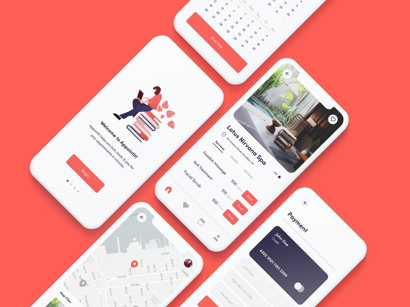
Appointit is the all in one app for discovering & booking service based appointments. As lead product designer, I worked with the CEO & UX Writer to design a new type of booking app to go to market with and identify product desirability. After conducting initial research with potential users & merchants, we identified a gap in the market to better service those two user groups. The application was specifically designed to optimize the booking appointment experience & ensure that customers choose the best available services locally.
-
Project details
Sector: Booking / Lifestyle
Project Type: UX/UI Design, Branding, User Research
Challenge: Develop new booking app concept
Team: Leo Gonzalez - Lead Product Designer
Fred Sosa - Lead UX Writer
Teo Almonte - Lead Developer
Design Brief
-
Problem
The CEO wanted to develop an app where users could easily book all of their appointments & services all in one platform. There was no other app in the market where users could book a variety of different services, most apps focused on one industry such as haircuts or wellness. He was frustrated with having to use many different apps/websites to manage appointments and discover new local services that would be beneficial for him.
-
Project Goal
The goal was to identify product market fit by designing and developing an app concept to test across channels to identify desirability. We needed to identify and build an MVP to be able to test on users and also pitch to potential investors.
-
Strategy
Conduct comprehensive user research to identify consumer needs and market opportunities, ensuring the development of a leading booking application. Utilize research insights to design and test a prototype, gathering valuable data on user motivations and potential enhancements to existing booking services. Based on these findings, establish a strategic product roadmap, define the minimum viable product (MVP), develop a cohesive brand identity and design system, and finalize the app's UX/UI in preparation for a successful market launch.
Discovery
Discovery
Exploring user needs and market gaps to create the right product.
Competitive Analysis
Starting with a competitive analysis provided a clear understanding of the major players in the booking industry, revealing their strengths, weaknesses, and unique approaches. By comparing different booking services side by side, I quickly identified a gap in the market—one that our client’s offerings were perfectly positioned to fill. This insight not only shaped our strategy but also gave us a competitive edge in creating a more seamless and efficient booking experience.
Research Plan + User Survey
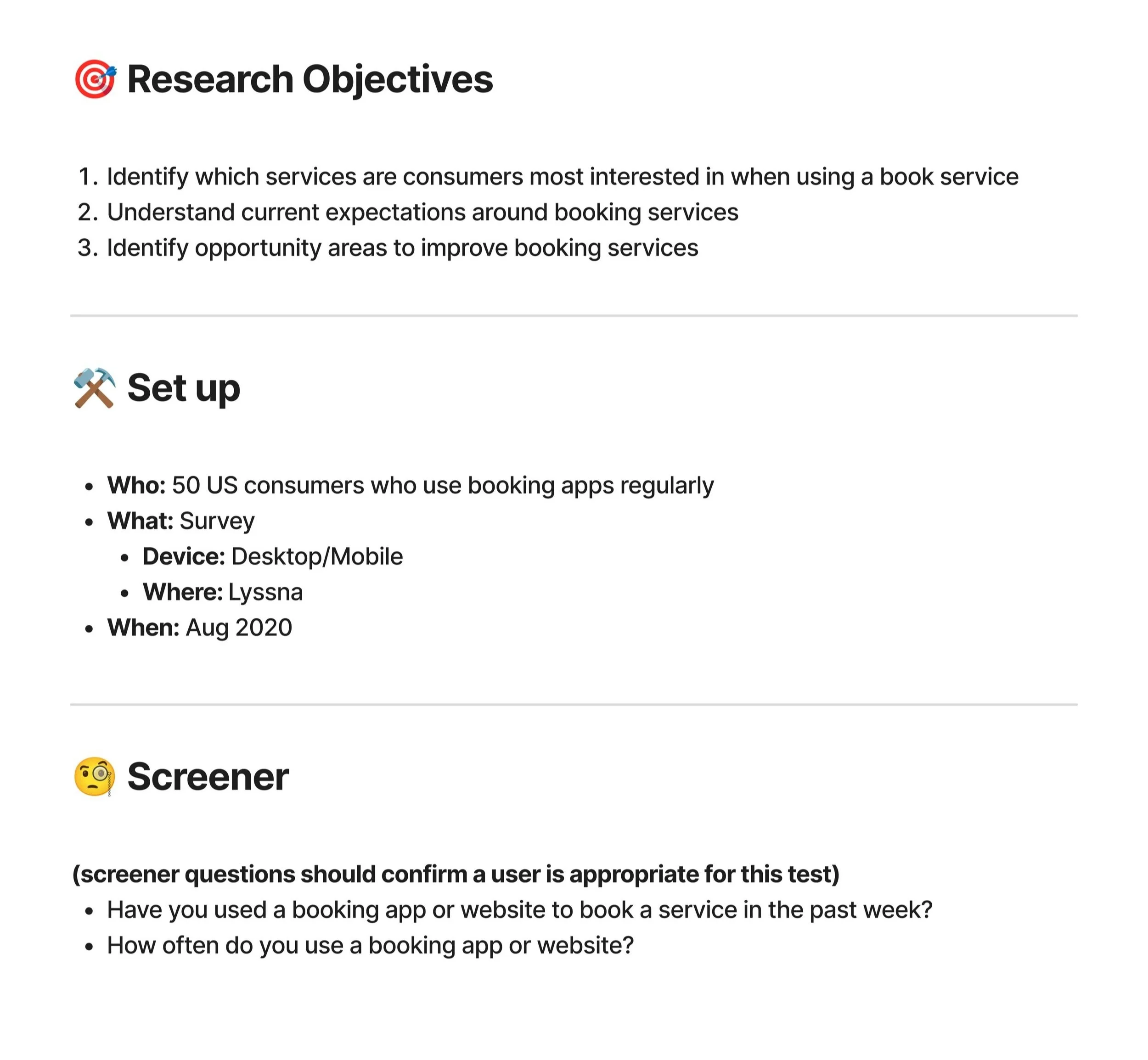
The interview process starts with creating a research plan. We decided to launch a survey to speak to a large demographic of booking users and understand their needs and expectations.
Research Objectives:
Identify which services are consumers most interested in when using a book service
Understand current expectations around booking services
Identify opportunity areas to improve booking services
Research Key Findings
The research showed that users book appointments twice a week, mostly for wellness (83%) and home services (62%). Verified reviews matter most when choosing a service, while juggling multiple apps and struggling to find new services were top frustrations. These insights helped shape a design focused on convenience, trust, and easy discovery.
Affinity Map
We created an affinity map to organize and make sense of our research findings, helping us identify key themes that guided the design process. The four main themes—Personalization & Customer Preferences, Marketing & Customer Retention, Ease of Use & Accessibility, and Scheduling & Availability Management—highlighted crucial areas to focus on. Understanding these themes allowed us to prioritize features that enhance user experience, improve customer engagement, and streamline booking processes. This clarity ensured that our next steps in design addressed real user needs, making the final product more intuitive, efficient, and user-friendly.
DEFINE
DEFINE
Turn research into clear objectives, create a roadmap, and establish product priorities.
Aligned Project Goals
In collaboration with the CEO, UX writer, & Lead Engineer, I facilitated an alignment exercise to identify the business goals, user needs, and technical limitations for the app. This is important because it ensures everyone understands what the business wants, what users need, and what technical challenges exist. Having this clear overview helps the team stay aligned and make better decisions. The diagram acts as a useful reference for everyone involved, making the development process more efficient and focused.
Product Roadmap
As the lead UX designer, I created a product feature roadmap as a key tool for turning strategic goals into practical steps for the project. During this phase, I list all possible product features, descriptions of those features, and what method we can use to further define these features. This helps me prioritize features based on solid insights, ensuring we focus on what will best serve both users and business goals.
IDEATE
IDEATE
Brainstorm, refine ideas, and explore different approaches to shape the product’s direction.
CUSTOMER JOURNEY MAP
This customer journey map outlines user actions, emotions, and touchpoints from discovery to post-appointment. It highlights key phases like browsing, booking, and feedback while identifying pain points and opportunities. Understanding this journey is crucial in product design to enhance user experience, streamline interactions, and improve satisfaction.
User flow
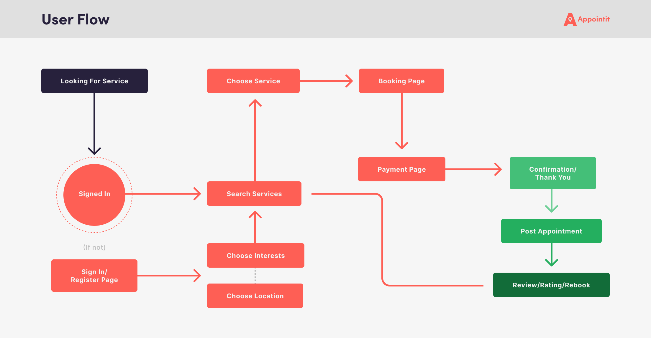
Mapping out the entire user flow of the new booking app is essential to understanding how users interact with the product at every step. It helps identify pain points, streamline navigation, and ensure a seamless booking experience. A clear user flow map improves usability by reducing friction, enhancing efficiency, and ensuring users can complete tasks easily. It also aligns the team on user needs, prevents design inconsistencies, and supports data-driven decision-making.
Low-fidelity wireframes
I created wireframes for the new booking app to define its layout and structure before detailed design and development. Wireframing helped test user flows, navigation, and functionality early, improving usability and user experience. It also supports collaboration by aligning designers, developers, and stakeholders.
Prototype
Prototype
Develop a functional model to replicate the user experience and validate features before full development.
Branding
It was critical to design a brand identity that not only could easily communicate the entire product in one logo but also stand out against competitors. I developed a logo with a focus on discovery and destination, two core values of the brand and product.
Design System
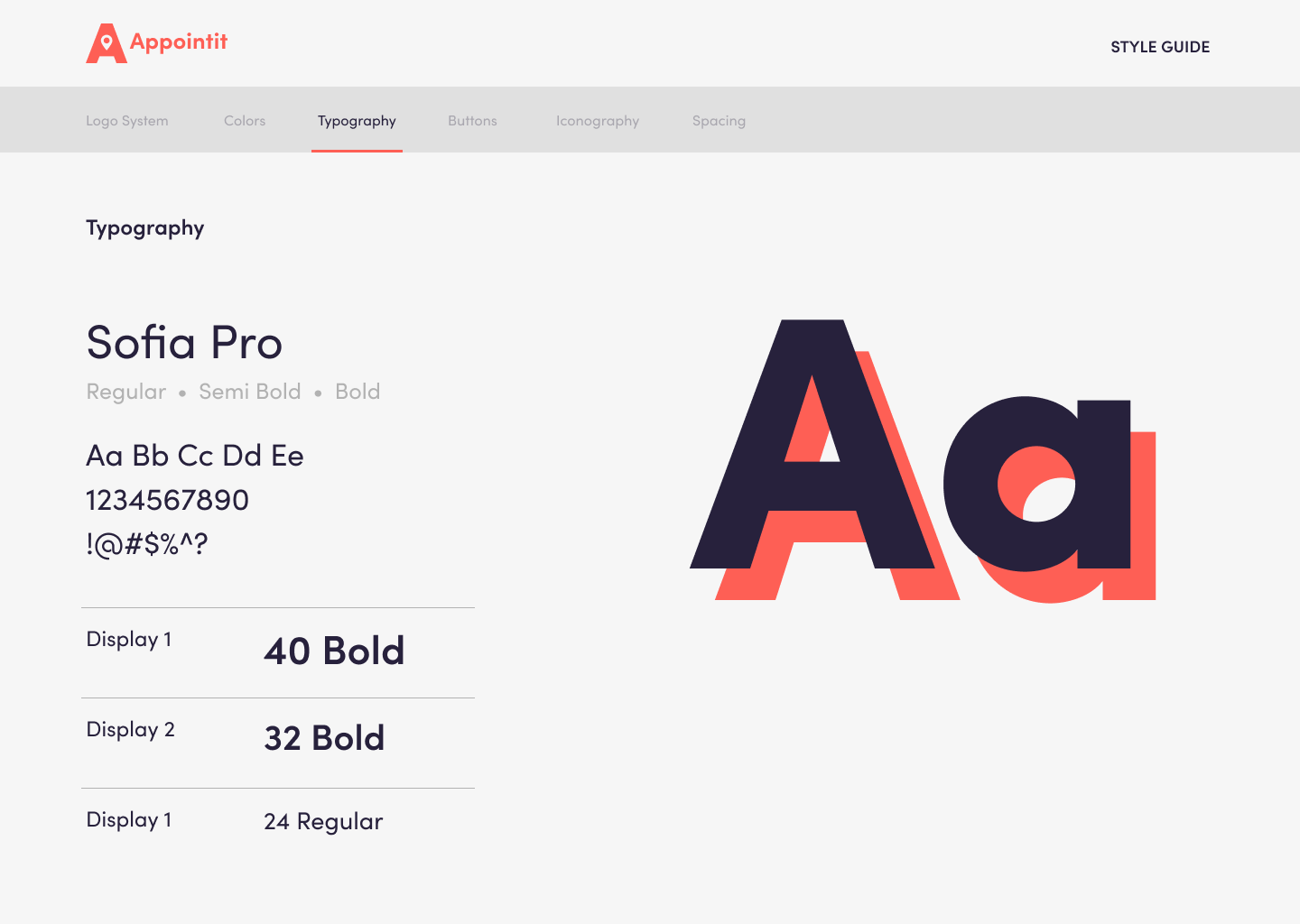
I created a design system that was scalable across the app and website to ensure alignment across our different touchpoints. It was crucial that we developed a simple design system because of our limited dev resources but also to put a bigger emphasis on the booking experience which is quite standard across the market.
High-fidelity wireframes
Next step was to develop high-fidelity wireframes to leverage for testing our design system and prototype for usability testing. These designs clarify UI elements, interactions, and functionality, providing developers with a clear reference for implementation. High-fidelity designs reduce ambiguity, minimize errors, and ensure a smooth handoff, improving communication and aligning the final product with the design vision. Early testing allows for adjustments before full development, leading to a more efficient and user-friendly app.
TESTING
TESTING
Assess how well users can achieve their goals with the product & identify potential pain points
User Testing
Leveraging our high-fidelity wireframes, I designed a prototype to mimic the app's functionality for our research participants. I put together a research plan that details how we will test our app to better understand how users would navigate and use our app and ensure we are asking questions that provide insight into our research objectives.
User Testing Objectives:
Assess how easily users can navigate the app and complete the service booking process.
Understand whether users can efficiently find services that meet their needs through search, filters, and recommendations.
Investigate how users interact with reviews and ratings and their impact on decision-making.
Usability testing results
At a high level all users were able to complete the booking experience with little to no friction and participants felt that reviews and personalization were crucial in their decision to book a new experience.
User Quotes
Users appreciate personalized features, like the app remembering past bookings and suggesting similar services. Easy access to reviews is also important, as it helps with decision-making during the booking process. Additionally, some users struggle to compare providers and would benefit from a built-in comparison feature. Improving personalization, review accessibility, and provider comparison could enhance the overall booking experience.
Rating Responses
I included some rating questions in the usability testing so we can get an overall sentiment on navigation and our rating system we built. Got a fairly high score for both rating questions, confirming our current hypotheses around the importance of an optimized booking experience & a detailed review system.
Affinity Map
I shared our user testing findings with the wider team and facilitated an affinity mapping exercise to synthesize the learnings in a collaborative manner. I believe collaboration around research efforts helps build excitement and education around user research. For usability tests, it’s effective to organize learnings around these 4 categories to establish focus areas we need to prioritize for our UX.
OUTCOMES
OUTCOMES
Performance metrics, testing insights, project reflection & next steps in product development.
Key Results
-
5,000+
Over 10,000 app sign ups in first week
-
100+
100+ Beta users testing app in New York
-
SEED
Seed investment round completed
NEXT STEPS
Post website launch, I facilitated a meeting with the wider team to begin to plan next steps for further development of the product based on our assumed learnings. It was important to do a fast follow of the experience once we had users & more team members on board. I broke up our strategy into two phases to set up the team for success for the remainder of the year, these included research, experiment, and discovery efforts.


